The Relationship Map: Supportiveness and Frequency
The Relationship Map helps you plot significant people by how supportive the relationship usually feels and how often you actually interact, then decide what to maintain, reconnect, bound, or step back from. Four named zones (Green, Opportunity, Danger, Red) cover the high-stakes combinations. It i…
Framework Card
- Name:
- The Relationship Map
- Goal:
- Plot significant people by supportiveness and interaction frequency, then decide which ties to maintain, reconnect, bound, or step back from.
- Flow:
- Supportiveness (supportive, ambivalent, demeaning) → Frequency (frequent, infrequent) → Green Zone → Opportunity Zone → Danger Zone → Red Zone
- Best For:
- Seeing where social time goes versus how supportive those ties feel; Boundary decisions when contact is frequent and mixed or demeaning; Reconnecting with supportive people who have gone quiet
Why it matters
Calendars fill with meetings, family chats, and group threads. Some of that contact restores you. Some of it is mixed. Some of it is regularly demeaning. Because the week looks “busy with people,” it is easy to treat every tie as equally deserving of the same time.
They usually are not. A few frequent, supportive ties may be carrying most of the load. A frequent ambivalent coworker may be using most of the weekday attention. A supportive mentor may have gone quiet. If you never look at supportiveness and frequency together, you keep investing by habit.
The Relationship Map, taught by Sahil Bloom in *The 5 Types of Wealth*, is a way to make that split visible, then change where attention goes. It is not a hunt for villains and not a clinical diagnosis.
What it is
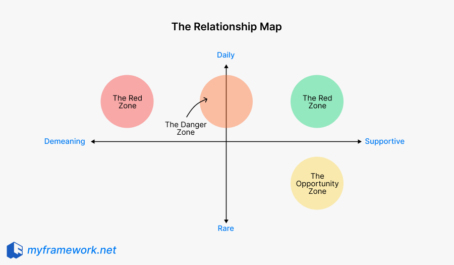
The Relationship Map uses two ratings:
- Supportiveness. Supportive, ambivalent, or demeaning, from a pattern of behavior rather than one bad week.
- Frequency. Frequent or infrequent actual contact, including digital.
Four named zones then suggest an attention move:
- Green Zone: supportive and frequent. Protect the relationship. Keep quality time and appreciation in the calendar on purpose.
- Opportunity Zone: supportive and infrequent. Reconnect if you want the tie, rather than only mourning that it faded.
- Danger Zone: ambivalent and frequent. Bound the contact, try a repair, or reduce frequency. Frequent and mixed is a management problem, not a mystery.
- Red Zone: demeaning and frequent. Distance or stricter boundaries. The label does not automatically mean “end the relationship,” especially when the person is a required coworker or a dependent family member.
Supportiveness has three levels, so this is not a perfect 2x2. Infrequent ambivalent or infrequent demeaning ties can exist. Name them. Do not force a marketing zone.
How it works
A useful pass is ratings plus an attention move, not a poster of four colors.
1. List significant people
Write ten to fifteen names across work and personal life who currently affect your energy. Skip celebrities and aspirational contacts. The range is a teaching size, not a law.
2. Rate supportiveness
For each name, choose supportive, ambivalent, or demeaning from the usual pattern. Do not diagnose personality. Do not invent motives.
3. Rate frequency
Mark frequent or infrequent from actual contact, not from how often you wish you spoke.
4. Place the named zones and decide the move
Green: maintain. Opportunity: reconnect if wanted. Danger: bound, repair, or reduce. Red: distance or stricter limits. If a pair has no named zone, write the pair in plain language (for example infrequent and demeaning) and still pick a move.
Review the map when the mix changes (a new manager, a move, a repaired friendship). It is a snapshot, not a permanent verdict.
How it compares
When another lens fits better, or when you need a complementary view, these frameworks do different jobs. They are not interchangeable labels for the same question.
| Framework | What it helps you see | How it differs from the Relationship Map |
|---|---|---|
| Johari Window | Open, blind, hidden, unknown panes of awareness | Known vs unknown, not support vs frequency |
| Stakeholder Saliency Model | Power, legitimacy, urgency | Organizational attention, not personal energy |
| SCARF Model | Five social threat and reward domains | Threat psychology, not a contact grid |
| Radical Candor | Care personally and challenge directly | A feedback stance, not a census of ties |
| SBI Model | Situation, Behavior, Impact | Wording for one event, not a portfolio map |
The Relationship Map is the lens for supportiveness and frequency, then a move of attention. Other methods help when the question is awareness, stakeholder power, social threat, or how to word feedback.
When to Use This Framework
- A periodic personal audit. A new quarter or a move is a natural time to list ten to fifteen people who actually affect your week.
- Fatigue that rest does not explain. Sleep is fine. The calendar is still full of frequent mixed or demeaning contact.
- A career or city change. Supportive people have gone quiet (Opportunity) while new frequent ties are still unrated.
- A repeating boundary decision. The same conflict keeps returning with someone you see often.
Example
A concrete example makes the structure easier to reuse when you are under uncertainty.
Example: A product manager whose evenings disappear
Alex lists twelve people. Green: a partner and one teammate who debrief honestly every week. Opportunity: a former manager who still replies with useful counsel, last spoken to four months ago. Danger: a daily stand-up peer who is not hostile but turns every thread into status competition. Red: a skip-level who publicly belittles estimates in the same meeting every Monday.
Implication: Protect Green on the calendar. Send one reconnect note in Opportunity. Bound Danger (shorter stand-up prep, no extra evening Slack). For Red, Alex cannot fire the skip-level. The move is stricter meeting hygiene and a documented estimate process, not a slogan about cutting toxic people.
Example: After a city move
Sam’s old Green friends are now Opportunity (still supportive, now infrequent). New coworkers are frequent and still unrated. Forcing them into Green because they are new would fake supportiveness. Rate them after a pattern exists.
Implication: The map caught a frequency shift. It did not tell Sam who is “high net worth.”
Takeaway
What the Relationship Map can help with
- Making supportiveness and frequency visible for a real list of people
- Naming Green, Opportunity, Danger, and Red as attention hints
- Deciding what to maintain, reconnect, bound, or step back from
- Catching the habit of giving the most time to whoever is loudest
What the Relationship Map cannot replace
- Awareness between self and others. The Johari Window maps what is known to you versus known to others. This map does not.
- Organizational stakeholder triage. Stakeholder Saliency sorts by power, legitimacy, and urgency. A customer or regulator is not a Green Zone friend.
- Social-threat coaching. SCARF names status, certainty, autonomy, relatedness, and fairness. It is not a contact census.
- Feedback wording or stance. SBI and Radical Candor help you say one hard thing. They do not sort a portfolio of ties.
- Therapy, HR process, or an abuse protocol. Demeaning and frequent contact can be dangerous. The map can flag it. It cannot treat it. Obligatory roles may have to stay in a hard zone.
Honest scope: the framework structures a two-factor judgment and an attention move. It does not replace the methods above, and it should not be sold as a way to eliminate people.
Frequently asked questions
Not by itself. Red means demeaning and frequent. If the person is a required coworker or a dependent family member, the move is often stricter boundaries and less optional contact, not a slogan about cutoff. If the situation is abusive, get appropriate help. The map is not that help.
A real list of people, a supportiveness rating, a frequency rating, named zones where they apply, and an attention move for each (maintain, reconnect, bound, or step back). A colored grid with no move is only inventory.
Johari maps what you know versus what others know. This map maps how supportive a tie feels versus how often you interact. You can need both. They are not the same grid.
Supportiveness has three levels and frequency has two. Bloom’s teaching names four action-heavy combinations. Infrequent mixed or infrequent demeaning ties still exist. Write them in plain language.
No. It is a personal attention audit. It does not assess personality, diagnose harm, or replace workplace process.